Good user experience (UX) is good business. The average American internet user spends nearly 24 hours per week on the internet, and best practices in UX design have become crucial not only to success online, but also in the physical world, where online brand and service experiences carry over into other real-time interactions.1 But since the internet is where we largely work, study, socialize and shop today, implementing proven UX design principles can make the difference between successfully engaging users and losing them to competing sites and services.
Here are eight UX design principles that can be implemented immediately.
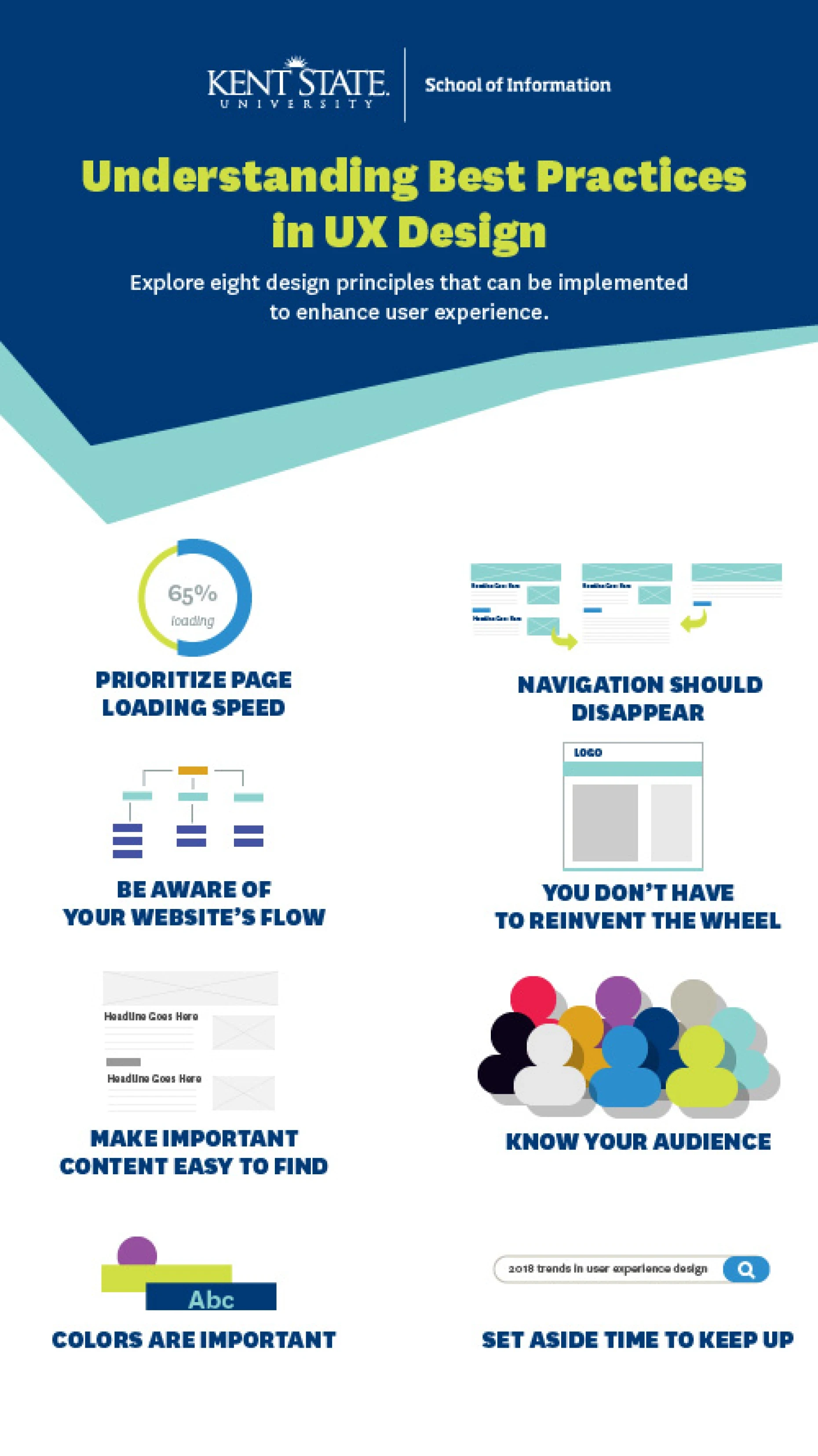
1. Prioritize Page Loading Speed
Page loading speed has a critical impact on user experience, as just a two-second delay in loading can increase page abandonment rates by 87 percent.2Internet giants like Google and Amazon are able to invest in massive infrastructures that enable their sites to load at breakneck speeds, but that isn’t the case for all (or even most) businesses. Web designers must strike a careful balance between robust design and a realistic understanding of the servers and other infrastructure available to deliver their content. There are many ways to structure and deploy good web design, but users won’t be around to see it if they have to wait too long for the page to load.
2. Be Aware of Your Website’s Flow
“Flow” refers to the way information is received as users interact with a webpage. Information should lead them down the page like a yellow brick road—fueling their excitement as they scroll and encouraging them to continue. Information should be clear and concise, and never overwhelming: Too much information is just as bad as no information at all.
3. Make Important Content Easy to Find
This feels like a no-brainer, but it is still very worth noting. If you want something to be noticed, make it visually prominent and direct the user to it with a compelling narrative. Users typically start in the upper-left corner of your webpage and work their way down, provided they like what they see and feel they are gaining traction toward their desired information. And they pay more attention to information at the top of the page—what’s known as “above the fold”—or before they have to scroll. Web users also tend to skim text until they find what they’re looking for, so it is critical to use simple, clear language.
4. Colors Are Important
Generally speaking, colors have built-in associations. Orange is associated with energy. Green feels natural. Purple has historically been linked to royalty and wealth. Do some research on the psychology of colors and work within a palette that communicates your brand’s desired message in conjunction with the feelings you want to evoke.
When it comes to calls to action, reserve one color and stick to it. With all other text, choose colors that have a high degree of contrast against your page’s background, which will make it more easily legible. This will also help make your website more accessible, as high-contrast images can be read more easily by people who are colorblind or visually impaired.
5. Navigation Should Disappear
Navigating between pages of your site should be seamless. In general, nothing should be more than three or four clicks deep. Navigation labels should be short—one word is best—and certainly no more than three. And this rule applies to design on the site level as well as on the page level: It should always be easy for users to find what they want.
6. You Don’t Have to Reinvent the Wheel
We are accustomed to seeing websites with a company logo at the top of the page, followed by a horizontal row of menu items. Sometimes, there’s a sidebar on the left or right with further links. Sticking to these typical web patterns isn’t necessarily bad: Good UX feels inevitable not just because it’s well-designed, but because it meets a user’s expectations.
7. Know Your Audience
Part of meeting a user’s expectations is knowing who they are. Users in different demographics have different needs and patterns of behavior. UX testing is a way to make sure you’re engaging an audience in the way you want. Find ten users within a website’s intended demographic and watch them use the site. If your website isn’t intuitive for all of them, there is still work to be done.
8. Know Your Audience
Some UX best practices are based in psychology, but some are just based on audience expectations and, as such, are subject to trends. Therefore, it’s important to recognize that what constituted great UX two years ago might not be at the forefront of the discipline anymore. If you’re going to commit to building websites with great UX, you’ll have to set aside time to read blogs and books to keep up with the latest and greatest in UX design.
Explore the best practices in user experience design, and learn how to redefine online experiences. Check out the online Master of Science in User Experience Design at Kent State University and take your UX knowledge to the next level.
Sources:
- Retrieved on June 8, 2018, from digitalcenter.org/wp-content/uploads/2013/10/2017-Digital-Future-Report.pdf
- Retrieved on June 8, 2018, from uxplanet.org/the-top-7-ux-design-tips-for-gaining-better-conversions-ee65d0bae8cc


