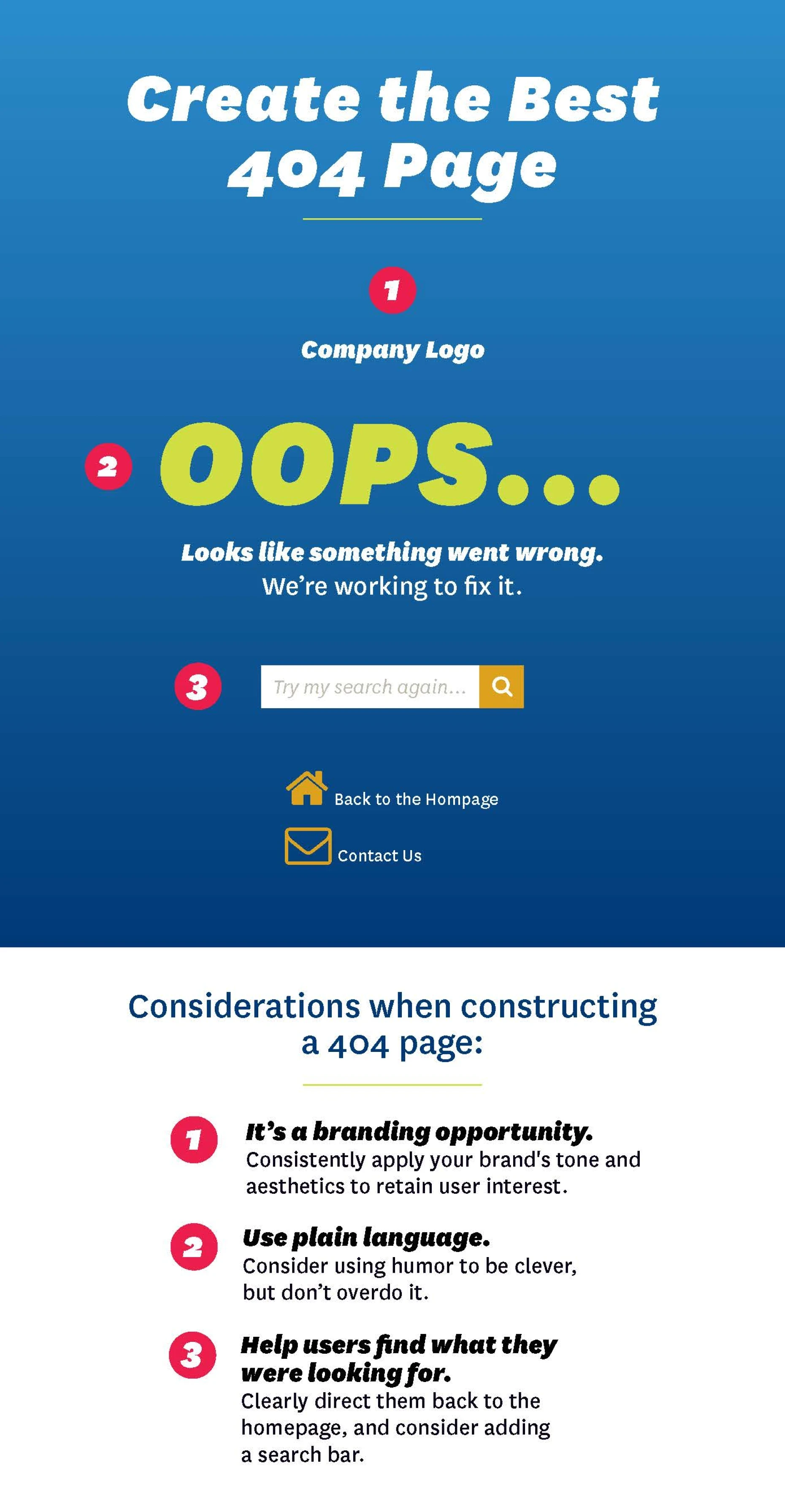
Nobody likes a 404 page. It’s never the page you were trying to find, and it’s usually not your fault that you ended up there. Standard error messages can be inscrutable, and the typically austere 404 page itself can disconnect the user from the overall site experience, which can sour them to your site and even your brand. So how do you create a 404 page that is dynamic, that easily redirects the user back to the content they want and that’s even a little bit fun?
Use Plain Language
Landing on an error message is always frustrating, and especially so if you don’t even understand what the error message means. A 404 page that features an overly technical message full of code language and programming jargon is undoubtedly going to confuse the user, and this can reduce their willingness to return to your site’s content. To mitigate this kind of user bounce, it helps to craft a message that clearly and simply explains to the user why they’ve arrived at a 404 page, and then make it easy for them to navigate back to the main site.
A 404 Page Is a Branding Opportunity
If users arrive at your 404 page by following a link from another site, it could end up being their initial exposure to your brand. While not ideal, this doesn’t have to mean that you’ve immediately lost that user’s interest. What it does mean is that it’s critical that your 404 page adhere to general best practices for user experience, including matching the aesthetics of the page to the rest of your site and ensuring that the microcopy (the snippets of text that guide users through your site interface) matches the rest of your brand tonality. Doing this will pay dividends in exposing users to your brand while increasing the chances of conversion.
Help the User Find What They Were Looking for
Nothing is more frustrating than a 404 page that is just a dead end. Slightly less frustrating is a link to return you to the homepage. Even better than that? A 404 page feature that helps the user navigate to the content they were actually looking for. Consider a spell check function that examines the requested URL and then recommends an alternative page. Similarly, you could include a search bar that leverages Google’s Custom Search API to suggest specific pages based on a user-provided word or phrase.
Use Humor
It’s hard for someone to be angry when they’re laughing. So if you’ve made a mistake within your site (and it’s always your mistake, never the user’s), do what you can to get the user laughing. You’ll be building goodwill for your brand while you simultaneously keep the user from closing their browser and forgetting about the reason they came to your site in the first place.
Be Clever
Wit and comedy are great ways to engage users, but so is interactive content. Some great 404 pages use video content or other interactive elements to gamify the 404 page experience. This is ideal because users want to engage; an error can thus be an opportunity to engage them in a new, fun way that even they didn’t expect. Not only that, but by placing this kind of content on a 404 page, you give users the exciting feeling that they’ve stumbled onto a secret.
…but Not Too Clever
At the same time, an overly clever, cluttered or cryptic 404 page can deter users just as forcefully as an overly technical error message. And if the content on your 404 page goes down as well, you’ll look doubly incompetent. Extend a dynamic user experience to your error message, but don’t go overboard. The goal is still to create a positive user interaction, and ultimately to redirect users back to the content they came to see.


